
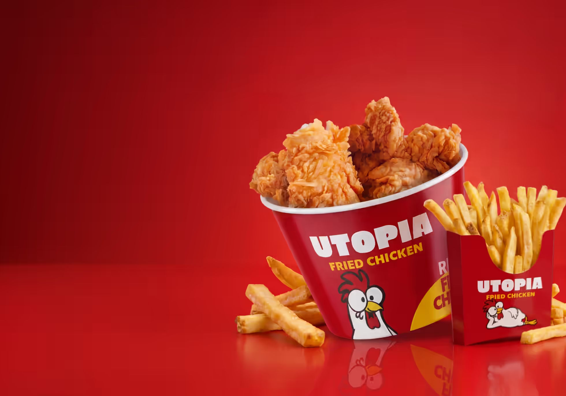
A loud, warm fried chicken brand.
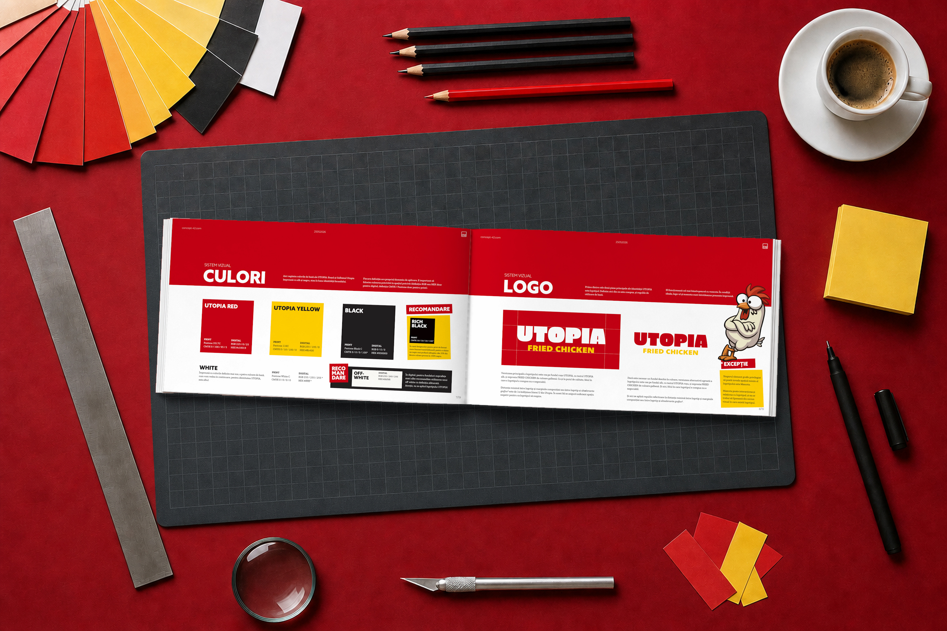
We designed the visual side of Utopia: a logo system, a mascot with a set of poses, colour, typography and photography direction. The brand book documents all of it, so menu boards, boxes and social posts look like they come from the same place.
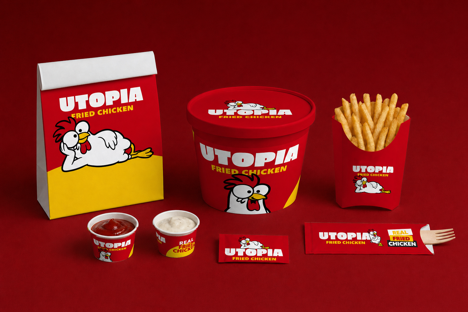
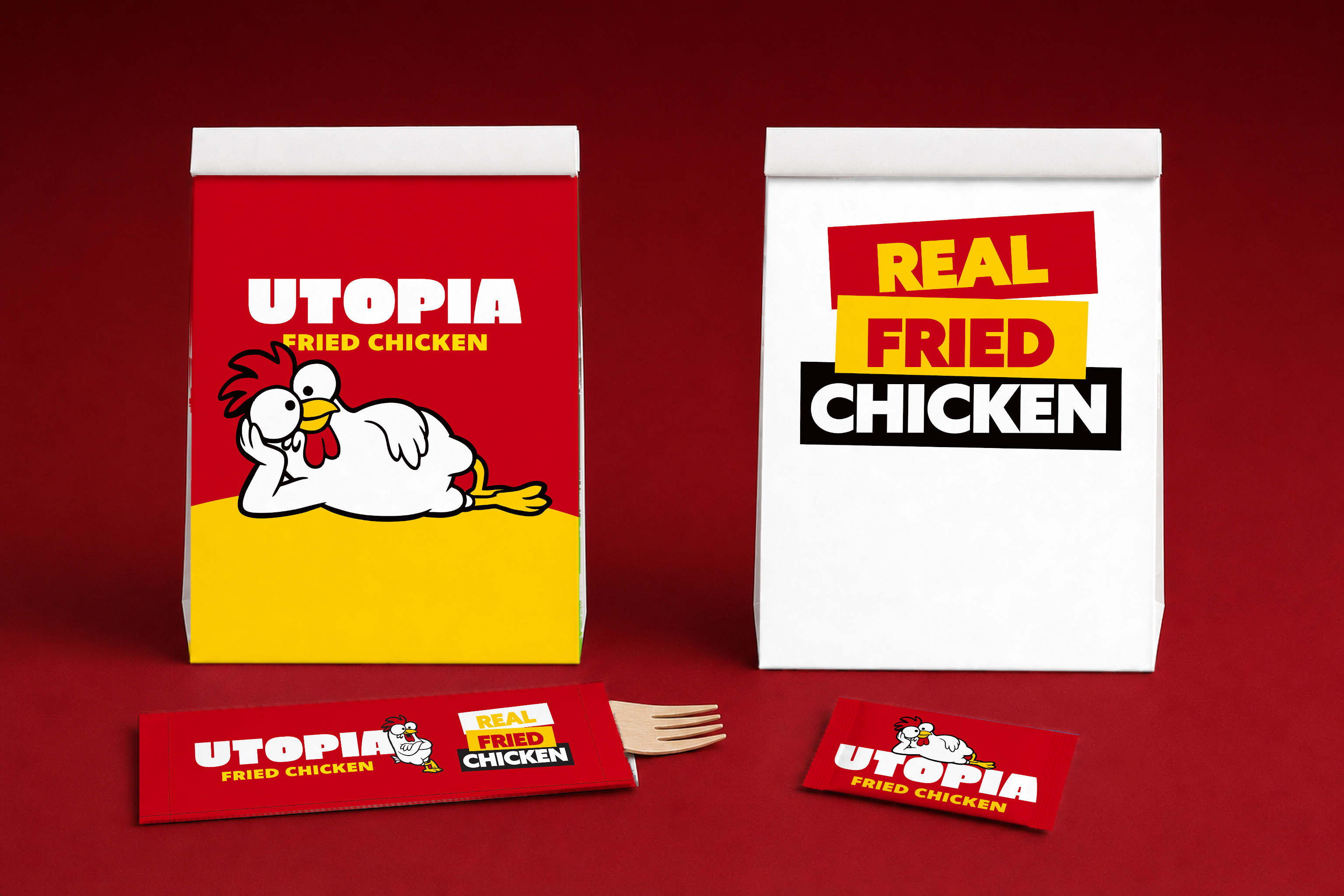
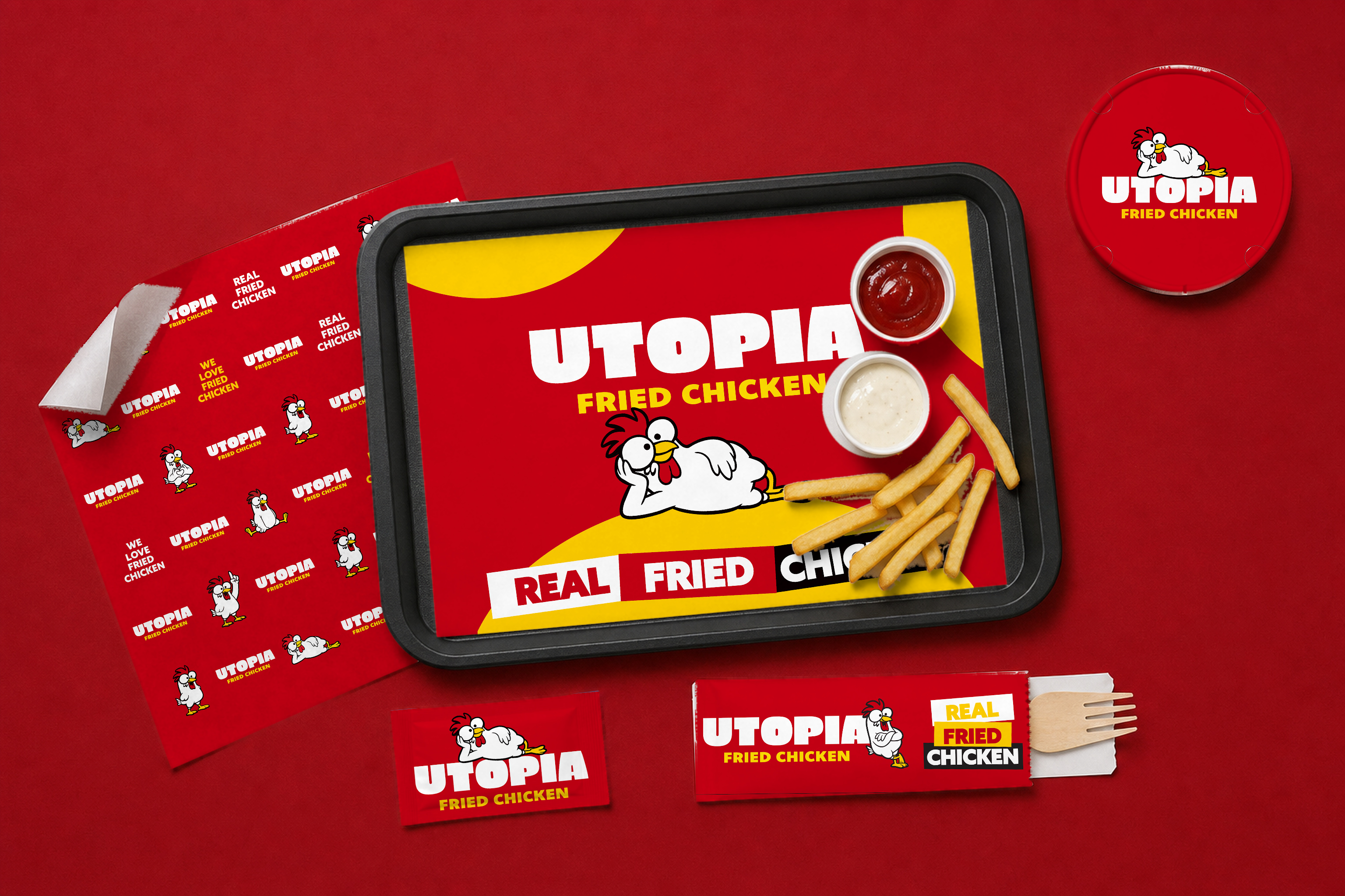
The identity runs across the takeaway kit: the 110 oz bucket and lid, the fries box, sauce cups, paper bags, tray liners, wrapping paper, cutlery sleeves and wet-wipe sachets. Most of the colour comes from brand red and yellow. The mascot changes pose from piece to piece, and the logo stays where the brand book puts it.
The brand book is 19 pages long. It covers the thinking behind the brand, colour for print and screen, the logo and its exceptions, the mascot and how it pairs with the logo, typography, photography rules (including how to vet AI-generated images), graphic elements, packaging and stationery. The last page links to the source files.